When most people think about creating a brand identity, their minds jump straight to the fun stuff: the logo, colors, typography, and brand voice. And yes, those are the tangible elements people will see and feel. But they are just the final expression of a much deeper strategic process.
Building Your Brand’s Strategic Foundation
Before you even think about picking a color palette or sketching a logo, the real work begins. This is the strategy phase, and honestly, it's what separates the brands that stick around from the ones that fade into the background. It's about building a genuine connection with your audience—one that’s authentic, consistent, and designed to last.
Too many businesses get this backward. They dive headfirst into the visual design, ending up with something that looks slick but feels hollow. A solid strategic foundation ensures every single decision you make down the line, from a marketing campaign to product packaging, is rooted in a clear and compelling "why."
Define Your Mission and Core Values
So, where do you start? With your mission. This is your brand's North Star. It's a simple, clear explanation of why your company exists beyond just turning a profit. What problem are you truly trying to solve? Who are you here to serve? This isn't just fluffy corporate-speak; it's the core principle that will guide your team and inspire your work.
Hand-in-hand with your mission are your core values. Think of these as the non-negotiable beliefs that shape your company's character and behavior. Are you all about innovation? Do you prioritize sustainability? Are you fiercely independent or community-focused? Try to nail down three to five values that genuinely reflect who you are. These will become the filter for every piece of content you create and every business decision you make.
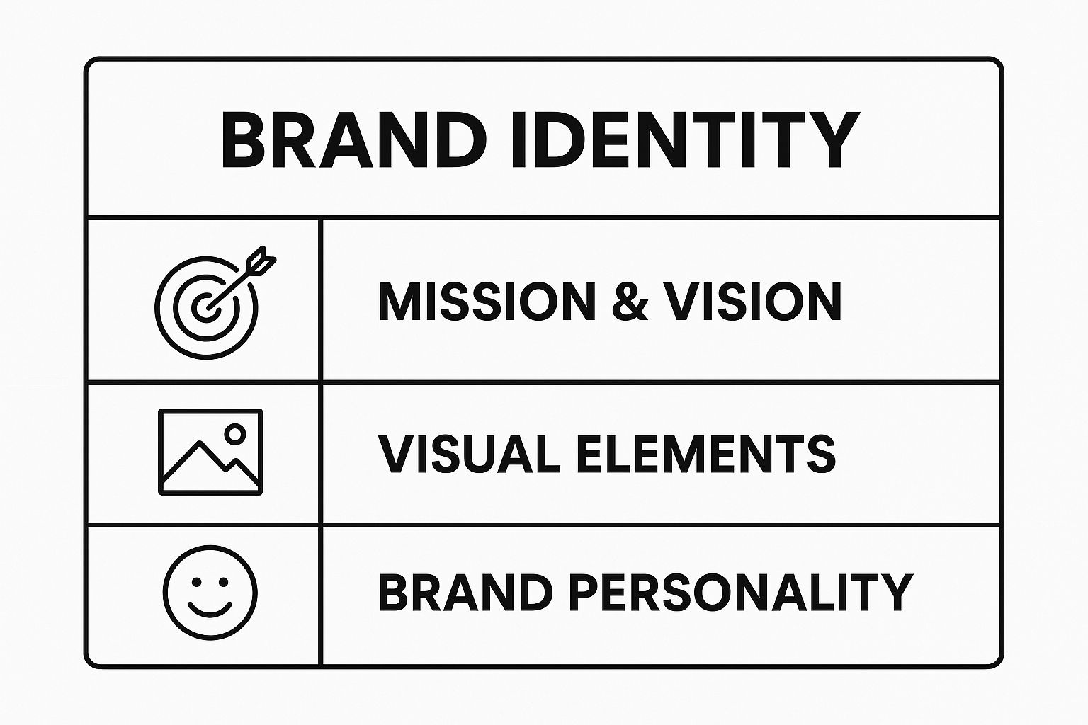
This infographic breaks down how these core components fit together, illustrating that a powerful brand identity is a balanced system of strategy and execution.
As you can see, the visual and personality elements are built upon that strategic base. Without it, the whole structure is wobbly.
Quick tip
Want to save 10+ hours a week on content?
Outbrand uses AI to generate a full month of on-brand social media posts in minutes. Join 1,000+ marketers who've already made the switch.
You can't build a brand in a bubble. The next critical piece of the puzzle is getting a deep understanding of two groups: your ideal customers and your competitors. This means creating detailed audience personas. And I mean detailed. Go way beyond basic demographics like age and location.
What are their biggest frustrations and challenges?
What gets them excited?
What other brands do they absolutely love, and why?
When you can answer these questions, you can build an identity that resonates on a personal level, making your audience feel like you truly get them.
At the same time, you need to size up the competition. Don't just glance at what they sell; analyze how they present themselves. What's their messaging? What does their visual style say about them? This isn't about copying them—it's about finding the gaps in the market where you can shine. Our guide on brand positioning examples dives deeper into how to carve out that unique space for yourself.
A brand's power lies in its ability to occupy a distinct and valued place in the customer's mind. Without clear positioning, you become just another option, easily replaced and quickly forgotten.
Articulate Your Unique Value Proposition
This all leads to your Unique Value Proposition (UVP). Your UVP is a clear, compelling promise you make to your customers. It answers the most important question they have: "Why should I choose you over anyone else?" A great UVP is specific, focuses on solving a real pain point, and makes your key differentiator impossible to ignore.
This strategic groundwork is more important than ever. The corporate identity design market is absolutely booming, projected to jump from $8.62 billion in 2024 to $9.85 billion in 2025—that's a massive growth rate of 14.3%. Businesses everywhere are realizing they need a distinct identity to stand out.
Before moving on, let’s quickly summarize the core strategic elements we've covered.
Core Brand Strategy Components
Component
What It Is
Why It Matters
Mission Statement
A clear declaration of your company's purpose beyond profit.
It provides a "North Star" that guides all actions and inspires your team and audience.
Core Values
The 3-5 fundamental beliefs that dictate your brand's behavior.
They create a filter for decision-making and ensure authenticity and consistency.
Audience Personas
Detailed profiles of your ideal customers, including their goals and pain points.
This allows you to create a brand that resonates on an emotional and personal level.
Competitive Analysis
An evaluation of other brands in your space to find market gaps.
It helps you identify opportunities to differentiate and position your brand effectively.
Unique Value Proposition
A concise statement that explains why you are the best choice.
It clearly communicates your primary benefit and gives customers a reason to choose you.
Defining these components gives you a solid, strategic blueprint.
It’s also crucial to understand how all this fits into the bigger picture. Grasping the difference between branding and marketing is a fantastic first step. It clarifies how your brand identity serves your larger business goals. With this strategic foundation firmly in place, you’re finally ready to start bringing your brand to life.
Designing a Memorable Visual Identity
Alright, you've done the heavy lifting on strategy. Now comes the fun part: giving your brand a face. This is where all that foundational work—your mission, values, and audience research—gets translated into the visual elements people will actually see, touch, and remember.
Think of your visual identity as your brand's silent ambassador. It's working for you 24/7 on your website, your packaging, your social media feeds, and even your business cards. A strong visual system doesn't just look good; it builds instant recognition and fosters a sense of trust. The goal here is to create a toolkit of assets that are not just beautiful, but also flexible enough to work anywhere and everywhere.
Your Logo Is More Than Just a Pretty Picture
Your logo is the first handshake. It's often the single visual that people will associate most strongly with your company. A truly great logo has to be a workhorse—it needs to look just as sharp blown up on a billboard as it does shrunk down to a tiny favicon in a browser tab.
Before a single pixel is pushed, you need to consider what type of logo aligns with your brand’s personality.
Wordmarks: These are font-based logos that spell out your company name. Think Google or Coca-Cola. They're direct, no-nonsense, and excellent for building name recognition from day one.
Lettermarks (Monograms): A simplified take on the wordmark, these use initials. Think HBO for Home Box Office. This is a smart move if your business name is a bit of a mouthful.
Icons or Symbols: These are the abstract or pictorial logos, like the iconic Apple or the Twitter bird. They're incredibly powerful once established, but they often require a significant marketing budget to connect the symbol to the brand name in customers' minds.
Combination Marks: This is the best of both worlds, pairing a symbol with a wordmark. The Disney logo, with its signature font and whimsical castle, is a classic example.
From the very beginning, think about versatility. Your logo absolutely must work in full color, but it also has to be just as effective in a single color—solid black or white. This ensures it’s recognizable and clean on everything from a simple printed invoice to a giant event banner.
The most common mistake I see is an overly complicated logo. Simplicity always wins. A clean, well-designed mark is far easier to remember and reproduce. It should capture the essence of your brand, not try to tell its entire life story in one small graphic.
Mastering the Psychology of Color
Color isn't just decoration; it's a powerful psychological shortcut. The right palette can evoke immediate emotion and set the entire tone for your brand. In fact, research shows that color can boost brand recognition by up to 80%. That's a huge impact.
Your brand's colors should be a gut-level reflection of its personality. Is your brand high-energy and daring, or is it calm and dependable?
Reds are all about excitement, passion, and urgency. It's why you see them so often in the food and entertainment industries.
Blues signal trust, security, and competence. It’s no surprise that tech giants and financial institutions lean heavily on blue.
Greens naturally connect to health, nature, and growth. This is the go-to for wellness, sustainability, and organic brands.
Yellows project optimism, creativity, and warmth.
Blacks and grays can communicate a sense of sophistication, luxury, or modern minimalism.
A practical color palette usually has one or two primary colors that do the heavy lifting, supported by a few secondary or accent colors. This gives you enough flexibility to design interesting marketing materials without sacrificing that cohesive, professional look.
Why Your Typography Choices Matter
Typography is the voice of your brand made visible. The fonts you choose speak volumes before a single word is read. A classic serif font (the ones with little "feet" on the letters, like Times New Roman) can feel established and trustworthy. On the other hand, a crisp sans-serif font (without the feet, like Helvetica) often feels modern, clean, and approachable.
Just as with your logo, readability is everything. Don't go overboard. A good rule of thumb is to stick with two or three fonts that complement each other:
A Primary Font: This is your hero font for headlines and major statements.
A Secondary Font: Choose this one for body copy. It has to be incredibly easy to read in long blocks of text.
An Accent Font (Optional): You can use this sparingly for things like call-to-action buttons or pull quotes to add a little flair.
Whatever you choose, test them out. Make sure your fonts are legible on a tiny phone screen and a large desktop monitor. A poor font choice can ruin the user experience, no matter how great your content is.
Defining Your Imagery and Graphic Style
The final piece of this visual puzzle is your approach to all the other graphics: photography, illustrations, icons, you name it. Consistency here is the glue that holds your entire visual identity together.
You need to establish clear, easy-to-follow guidelines. For instance:
Photography Style: Are your photos bright and airy with lots of natural light? Or are they moody and high-contrast? Do they primarily feature people, products, or abstract concepts?
Illustration Style: If you use illustrations, what kind are they? Minimalist line art? Whimsical characters? Data-driven infographics?
Iconography: Your icons should look like they belong to the same family. Are they simple line icons, filled shapes, or multi-colored?
By defining these standards, you empower everyone—from your internal design team to a freelance social media manager—to create work that feels consistently and authentically you. This shared visual language reinforces who you are at every single touchpoint, building a brand that's strong, memorable, and undeniably professional.
Finding Your Authentic Brand Voice
While a stunning visual identity is what first grabs someone's attention, your brand’s voice is what truly builds the relationship. The words you choose are just as crucial as your logos and color schemes because they dictate how your audience feels when they interact with you. A brand identity that genuinely connects has to be built on a voice that is both unique and unwavering.
A common point of confusion is the difference between brand voice and tone. Here’s a simple way to think about it: voice is your brand’s core personality, and it doesn't change. Tone, on the other hand, is how that personality adapts to different situations. You'd naturally use a different tone in a celebratory social media post than you would in a serious customer support email, but the underlying voice—that core personality—always shines through.
Defining Your Brand's Personality
Before you can write a single word of copy, you have to know who your brand is. Is it a wise mentor? A quirky best friend? A clever innovator? A great place to start is to literally imagine your brand as a person and jot down their key personality traits.
Try brainstorming a big list of adjectives that could describe your brand. Then, be ruthless and narrow it down to the three to five that feel the most authentic. This isn't about trying to be everything to everyone. It's about staking out a clear point of view that will attract the right people.
Are you playful or serious?
Formal or casual?
Modern or traditional?
Energetic or calm?
Getting clear on these answers gives you a solid foundation to build on. For instance, a fintech company might land on being "Authoritative, Clear, and Empowering," while a brand that makes snacks for kids might choose "Joyful, Simple, and Trustworthy." These core traits become the guiding light for every word you write.
A brand's voice has to be an authentic reflection of its core values. When your messaging feels disconnected from who you really are, customers can sense it. Consistency in voice builds trust faster than almost anything else.
Translating Personality into Practical Guidelines
Once you've defined your brand's personality, you need to make it actionable. This means creating clear messaging guidelines so that anyone writing for your brand—whether it's a seasoned copywriter or a social media intern—can do so consistently. This is where many businesses decide to bring in an expert.
In fact, the demand for this kind of strategic work is booming. The global branding agencies market was valued at $5.2 billion in 2023 and is projected to hit $8.7 billion by 2032. Agencies excel at turning abstract personality traits into concrete, usable rules. You can dig into the data on the growth of the branding agencies market here.
To get started on your own, a simple "Do's and Don'ts" chart based on your chosen traits is incredibly effective.
Example Brand Voice Dos and Don'ts
Trait
Do
Don't
Friendly
Use conversational language, ask questions, and use contractions like "you're" and "we'll."
Rely on overly formal language, industry jargon, or a cold, distant tone.
Expert
Back up claims with data, explain complex topics simply, and communicate with confidence.
Make unsupported claims, oversimplify things to the point of being vague, or sound arrogant.
Playful
Use humor when it’s appropriate, try out clever wordplay, and keep the energy upbeat.
Make jokes that could alienate or confuse your audience, or be silly in serious situations.
A framework like this ensures that every piece of communication, from a website headline to an email sign-off, reinforces your brand identity. For a deeper dive, our complete guide on creating brand voice guidelines offers actionable steps and templates to get you going.
By developing a strong, authentic voice, you create a more memorable and engaging experience that helps turn casual browsers into loyal fans.
Creating Your Brand Guidelines Document
You've done the hard work of defining your brand's strategy, visuals, and voice. Now it's time to bring it all together. The final, critical piece of the puzzle is creating a brand guidelines document, often called a brand bible or style guide. This document becomes the single source of truth for your business—the playbook that keeps everyone on the same page as you grow.
Think of it as the operational manual for your brand's personality. It’s what you’ll hand over to your internal team, freelance partners, and agencies so they can represent your brand flawlessly. A strong brand guide is what elevates a good brand identity to a great one by preventing the kind of dilution and confusion that can happen across different marketing channels.
Laying Out the Core Components
A good brand guide starts with the big picture before diving into the nitty-gritty details. Always begin with the strategic heart of your brand. This provides the "why" behind every rule that follows and gives your team the context they need to make smart decisions.
Mission and Values: Start by restating your brand’s core purpose and the principles that guide its character. This really sets the tone for everything else.
Brand Personality and Voice: Pull in the personality traits you’ve already defined. This is the perfect place to include that "Do's and Don'ts" chart for your brand voice, offering clear, practical guidance.
Audience Personas: Give a brief but clear description of your ideal customer. It’s a powerful reminder of who your team is actually talking to.
This initial section ensures that anyone picking up the guide understands the soul of the brand, not just its surface-level look. Getting this alignment right is what makes an identity feel truly authentic.
The real job of a brand guide is to create clarity and remove all the guesswork. The more specific you are, the more empowered your team will be to make on-brand decisions quickly and confidently.
Defining Your Visual Toolkit
This is the section your team will reference most often, so it has to be crystal clear. It's the blueprint for your brand’s look and feel, providing all the necessary assets and rules to maintain visual consistency.
Your logo is your most important visual asset, so start there.
Logo Usage Rules: Show your primary logo, any secondary versions, and icons. You need to specify the minimum allowable size and the required clear space (or exclusion zone) around it. This prevents it from ever looking crowded or lost.
The Don'ts: This part is absolutely critical. Show visual examples of what not to do. Don’t stretch the logo, don’t recolor it, don’t slap it on a busy photo. From my experience, these visual "don'ts" are often more instructive than the rules themselves.
With the logo covered, it’s time to detail your colors and fonts.
Color Palettes and Typography Systems
You have to be incredibly specific here. Vague instructions like "use our blue" are a recipe for disaster, guaranteeing a dozen different shades will pop up across your materials.
Your color section must include:
Primary Palette: These are your main, go-to brand colors.
Secondary Palette: These are your accent colors, perfect for things like call-to-action buttons or highlights.
Color Codes: Provide the HEX, RGB, and CMYK codes for every single color. This ensures perfect accuracy whether the asset is for a screen or for print.
For typography, you need to clearly outline your font hierarchy. Define which font (and what weight or style) to use for headlines (H1, H2, H3), body text, and smaller captions. Just like with color, precision is everything.
If you need a solid starting point, our comprehensive free brand guidelines template provides an excellent structure for organizing all these elements into a professional document that’s easy for anyone to use.
Imagery and Application Examples
Finally, you need to show how it all comes together in the real world. This is where you bring the abstract rules to life. This section can include guidelines for your photography style (e.g., "all photos should feel bright, authentic, and people-focused") or rules for any custom illustrations you use.
Most importantly, show mockups. Display what your brand actually looks like on a social media post, a website homepage, a business card, or in an email newsletter. These practical examples transform the rules from a list of instructions into a powerful source of inspiration for anyone creating content for your brand.
Putting Your Brand Identity Into Action
So, you've got a killer brand identity on paper. That's a great start, but it's only half the battle. A brand identity doesn't start building real-world value until it’s out there, living and breathing across every single place a customer might interact with you. This is the moment your internal strategy becomes an external reality.
The rollout isn't just one big launch party. Think of it as a two-front effort. You’ve got to get your own team genuinely excited and aligned internally. At the same time, you need a smart, coordinated plan for your external launch—across your website, social media, marketing, and even physical items like packaging. Nail both, and your brand will be just as strong on the inside as it is on the outside.
The Internal Launch and Team Alignment
Before you even think about showing your new look to the world, you have to introduce it to your most important audience: your team. Every single employee is a brand ambassador, whether they’re in sales, support, or engineering. Their buy-in is absolutely essential for keeping things consistent. If your own people don't get it, how can you expect customers to?
Kick things off with a company-wide meeting or presentation. Don't just show them the new logo; walk them through the why. Share the research, the strategy, and the personality you worked so hard to define. You want them to feel like they're on the inside track, a core part of the brand's next chapter.
Make Assets Easy to Find: Put your brand guidelines, logos, color codes, and templates in a central, easy-to-access spot like a shared drive or company portal. No excuses for using the old stuff.
Run Practical Workshops: Host small training sessions for different departments. Show the sales team how to use the new pitch deck. Walk the marketing team through the new visual style for social media. Make it hands-on.
Update Internal Systems: This is an easy one to forget. Make sure things like email signatures, internal chat platforms, and presentation templates are all updated.
Getting this right builds a powerful sense of ownership. When your team is genuinely on board, the way they present the brand to the world becomes far more authentic and cohesive.
Rolling Out Your Brand to the World
Once your internal crew is fired up, it’s time for the public reveal. The key here is coordination. A messy, staggered launch just creates confusion. While you can phase certain elements, your main digital properties need to flip the switch at the same time for a unified, impactful debut.
Your website is your digital home base, so it has to be the top priority. Every single part of it, from the hero image on the homepage to the copyright notice in the footer, needs to scream your new identity. Right after that, tackle your social media profiles—update your banners and profile pictures, and craft an announcement post that explains the change and what it means for your community.
A brand's value isn't built in a day. It's the sum of countless small, consistent interactions over time. A successful launch isn't just a single event; it's the start of a long-term commitment to getting every one of those interactions right.
This commitment to consistency is what separates great brands from the rest. It's not just about looking good; it's a fundamental business driver. In fact, companies that maintain a clear and consistent brand strategy can see revenue growth between 10% and 20%. That’s a serious return on investment. If you're curious, you can dig deeper into the data behind strategic branding and business performance.
Maintaining Consistency Through Brand Audits
Building a brand is not a "set it and forget it" project. Over time, things can start to drift. To keep your brand sharp and your message clear, you need to perform regular brand audits. Think of it as a routine health check-up. For most businesses, doing this once a year is a solid plan.
An audit is a systematic review of every single place your brand shows up. Here’s how it usually works:
Gather Everything: Collect examples of all your marketing materials—recent social posts, ad campaigns, email newsletters, sales brochures, website pages, you name it.
Compare to the Playbook: Go through each item with your brand guidelines in hand. Is the logo being used correctly? Are the colors and fonts on-brand? Does the copy sound like you?
Spot the Gaps: Make a list of every deviation. Maybe the sales team is still using an old PowerPoint template, or a recent social campaign went a little rogue with its photo filters.
Make a Plan: Create a straightforward action plan to fix the inconsistencies you found.
This process helps you catch "brand drift" before it becomes a real problem. It ensures your identity stays potent and effective, and it often reveals new opportunities to improve and evolve your brand for the future.
Common Questions About Creating a Brand Identity
As you start piecing together your brand identity, you’re bound to hit a few roadblocks or confusing terms. That's completely normal. Getting these common questions answered upfront will help you move forward with confidence and build a brand that truly works.
Think of this as a quick chat to clear up some of the most frequent sticking points we see people encounter. Let's dive in.
How Long Does It Take to Create a Brand Identity?
This is the classic "it depends" question, but I can give you some real-world timelines. The truth is, the process can range from a few intense weeks to several months, depending entirely on the scale of your project.
For a small business or a solo founder who already has a solid vision, you might be looking at a few weeks to nail down the essentials. But for a larger organization that needs deep market research, multiple stakeholder approvals, and a coordinated launch across many platforms, the timeline often stretches from three to six months.
A typical project usually breaks down like this:
Strategy & Research: 1–4 weeks
Visual Design: 2–6 weeks
Guideline Creation: 1–2 weeks
Implementation & Launch: 2-4 weeks
If there's one piece of advice I can offer, it's this: don't rush the strategy phase. The time you invest in research and positioning at the very beginning is where the magic happens. It creates the foundation for everything that follows, ensuring your final identity isn't just pretty, but powerful.
Should I DIY My Brand Identity or Hire an Agency?
This is a huge decision, and it usually comes down to a trade-off between your budget, time, and expertise.
Going the DIY route is absolutely possible, especially for early-stage founders with a clear vision and limited funds. There are more tools and templates available today than ever before, making it easier to create something decent to get you started.
However, hiring a professional agency or a seasoned freelancer brings an objective, strategic perspective that's almost impossible to replicate when you're "in the bottle." They have the experience to see the market from the outside, the design chops to create a truly unique visual system, and the foresight to build something that can scale with your business. They're not just creating a logo; they're architecting a competitive advantage.
A smart middle-ground for many startups is to start with a thoughtful DIY identity to launch and test the market. Then, once you have traction, you can reinvest in professional help to polish your identity for the next stage of growth.
What Is the Difference Between Brand, Branding, and Brand Identity?
People throw these terms around all the time, often using them interchangeably. But they mean very different things, and knowing the distinction is key to thinking like a true brand strategist.
Brand identity is what you create. Branding is what you do. Brand is how you're perceived.
Let's unpack that a bit:
Brand Identity: These are all the tangible things you can see, touch, and hear. It’s your logo, color palette, fonts, and the tone of your voice. It's the "stuff."
Branding: This is the action of using your brand identity. It's the continuous process of shaping how people see you through your marketing, your customer service, your social media posts—every single touchpoint.
Brand: This is the result of it all. It’s the gut feeling people have about you. It's your reputation, the emotional connection, and what people say about you when you're not in the room.
Simply put, you use your brand identity as a tool in the process of branding to build your brand.
How Often Should I Update My Brand Identity?
There’s no hard-and-fast rule here, but you should never just "set it and forget it." A good practice is to run an internal brand audit at least once a year to make sure everything is still aligned, consistent, and working hard for you.
You might consider a minor "refresh" every 3-5 years. This isn't a total teardown but more of a modernization. Maybe you tweak your color palette, update your photography style, or switch to a more modern font. It keeps you from looking dated.
A full-blown "rebrand," on the other hand, is major surgery. You should only undertake this when there's a fundamental shift in your business—like a new core mission, a merger, or when your current identity is actively holding you back from connecting with your audience. Otherwise, stick to consistency. Consistency is the cornerstone of building recognition and trust.
Ready to stop guessing and start creating? With OutBrand, you can instantly generate a fully branded 30-day social media content calendar. Just upload your brand kit, define your mission and audience, and get a tailored mix of carousels, memes, tips, and reels complete with captions and on-brand visuals. Transform your brand management from a time-consuming chore into an effortless, results-driven engine for growth. Get your professional content calendar today!